
Laurel Loves | Color Palettes
We love all the different designs we get to witness here at The Laurel. Whether we get to assist with brainstorming ideas along the way or see the couple’s dream come to life on the day-of, we are constantly amazed at the ways that our clients tie in texture, and especially color. From beginning to end, each detail is carefully curated to compliment the vision for the day.
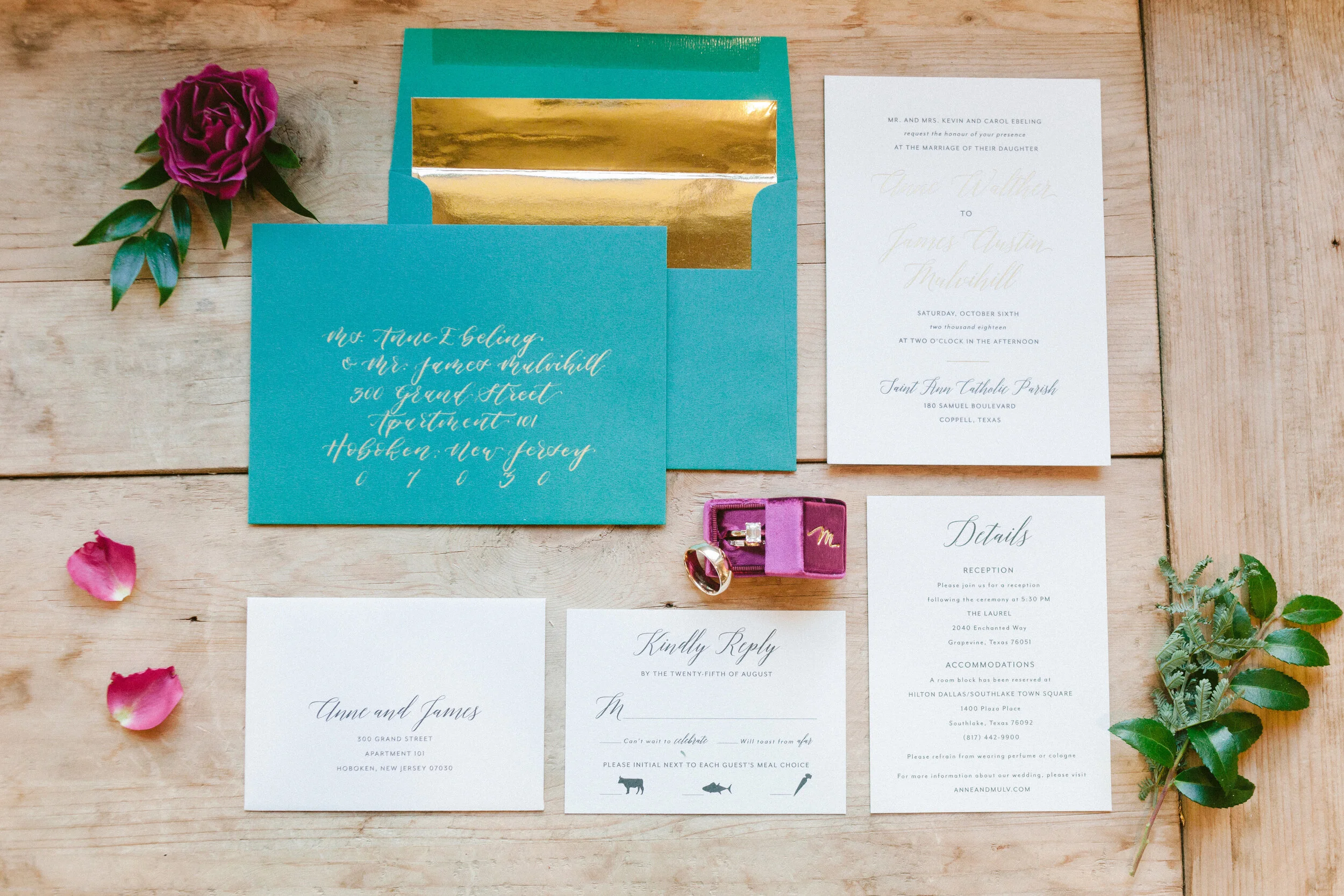
Today, we wanted to share some inspiration that we feel is at the heart of every wedding- the color palette. There are so many ways to incorporate color into your day- bridesmaid’s dresses or groomsmen’s ties, florals, table linens, invitation suites; the list could go on forever! No matter the shade, we can’t help but swoon over these color coordinated details!


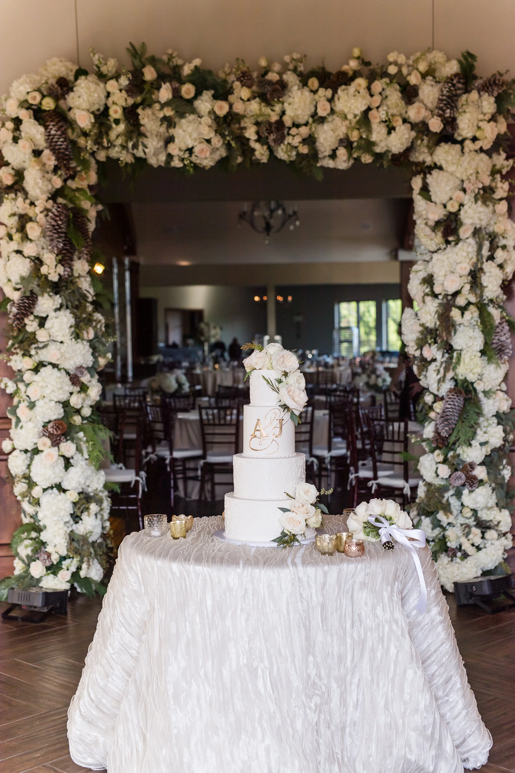
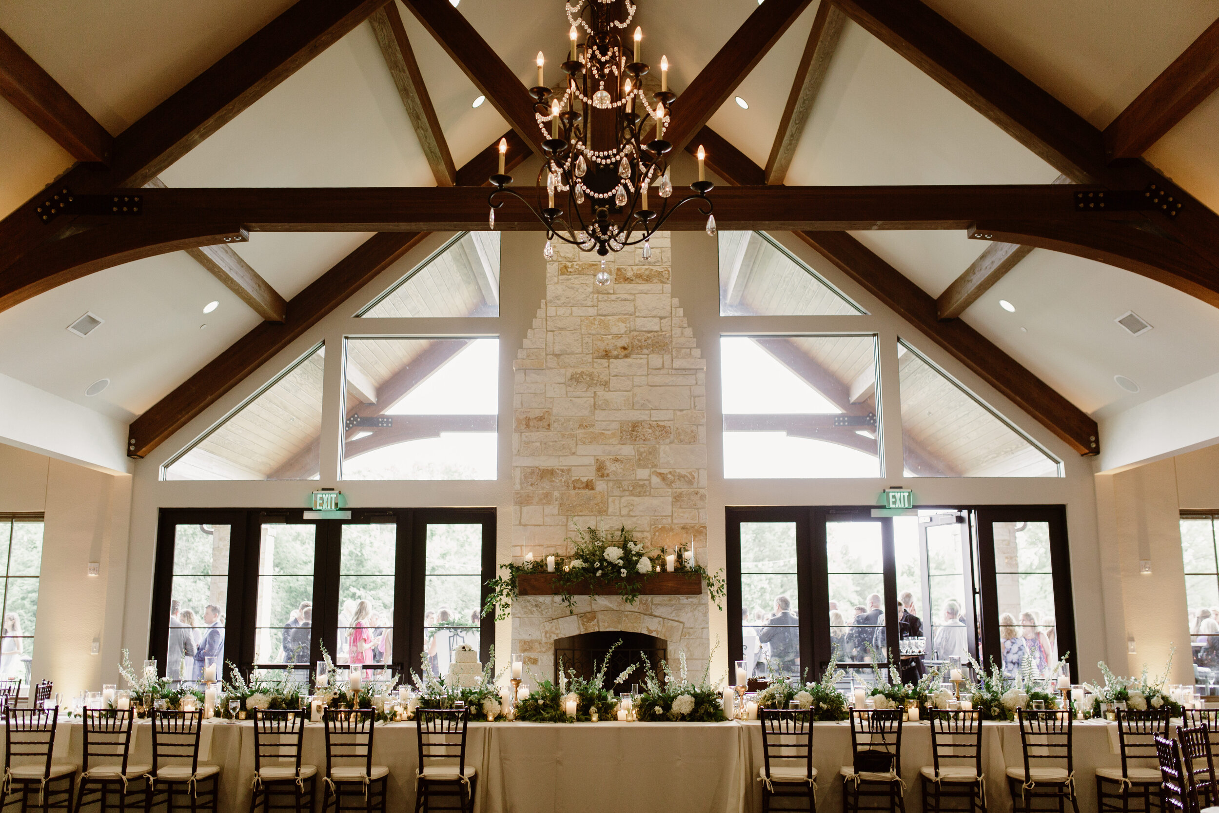
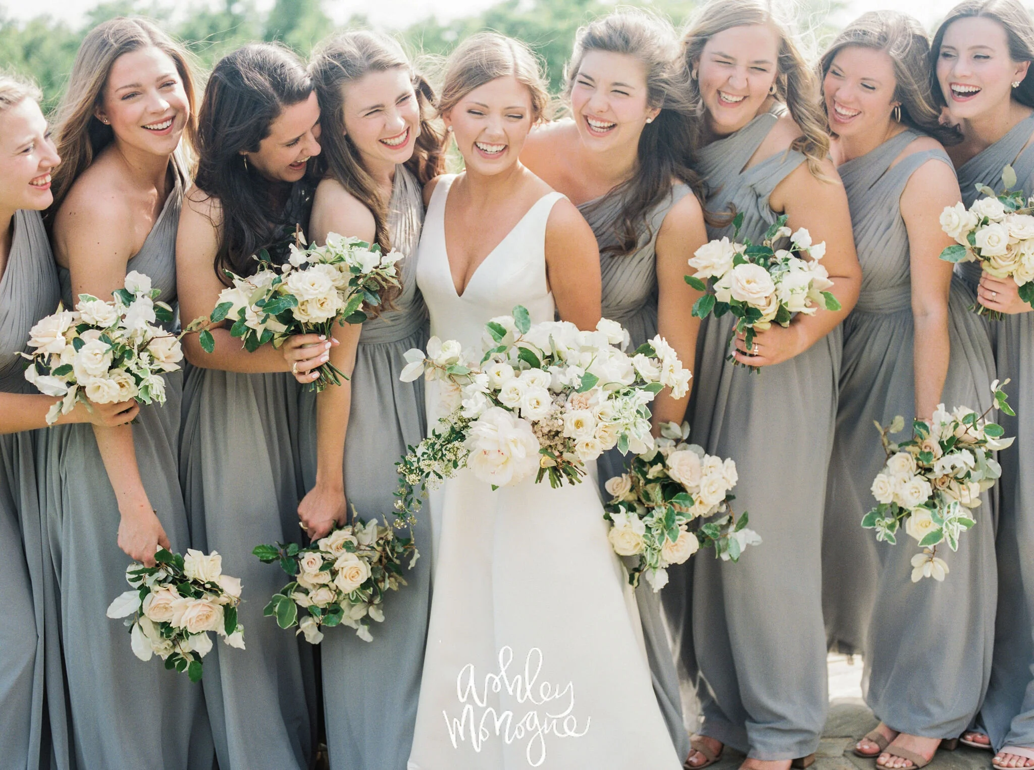
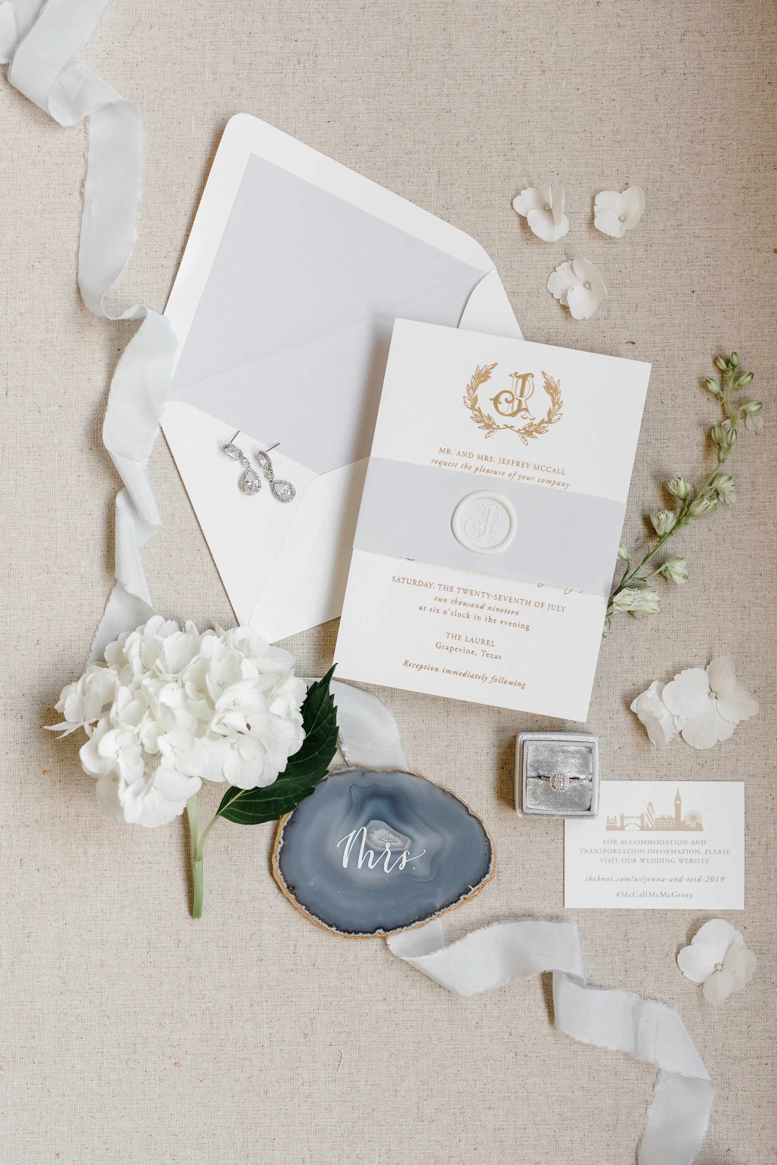
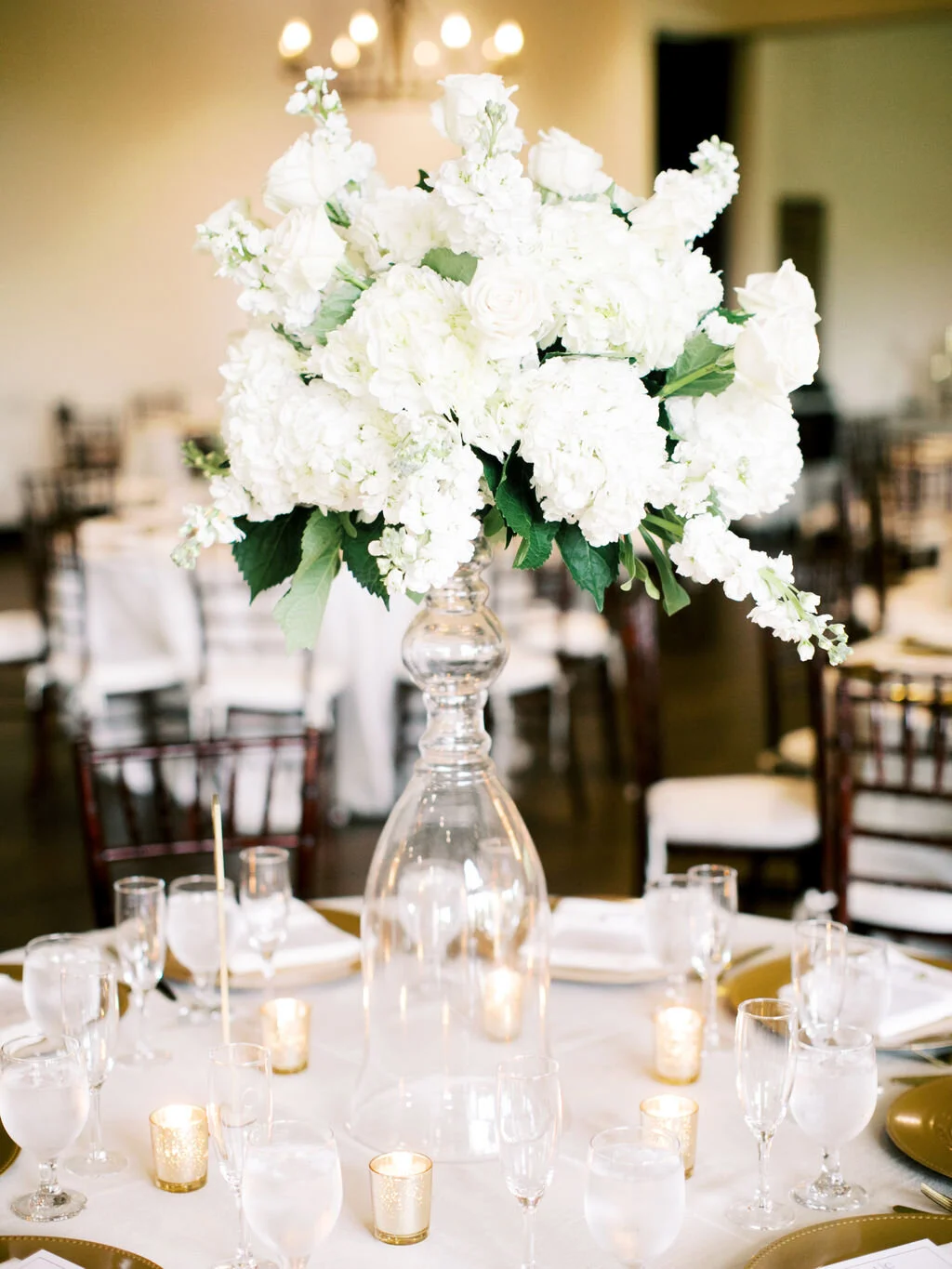
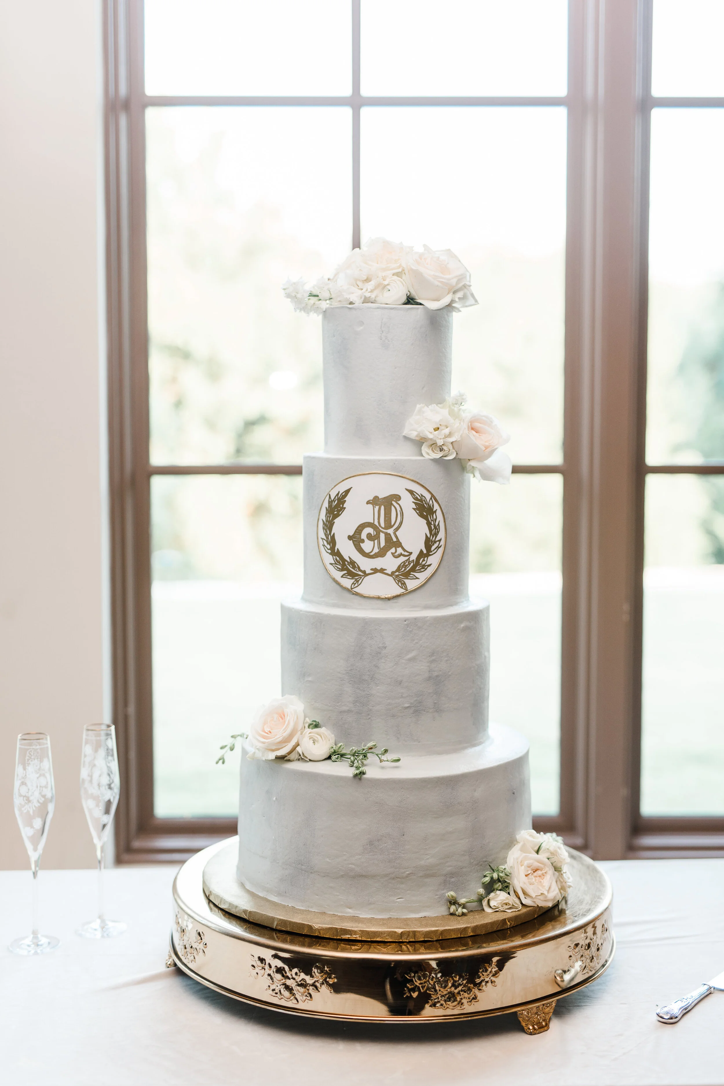
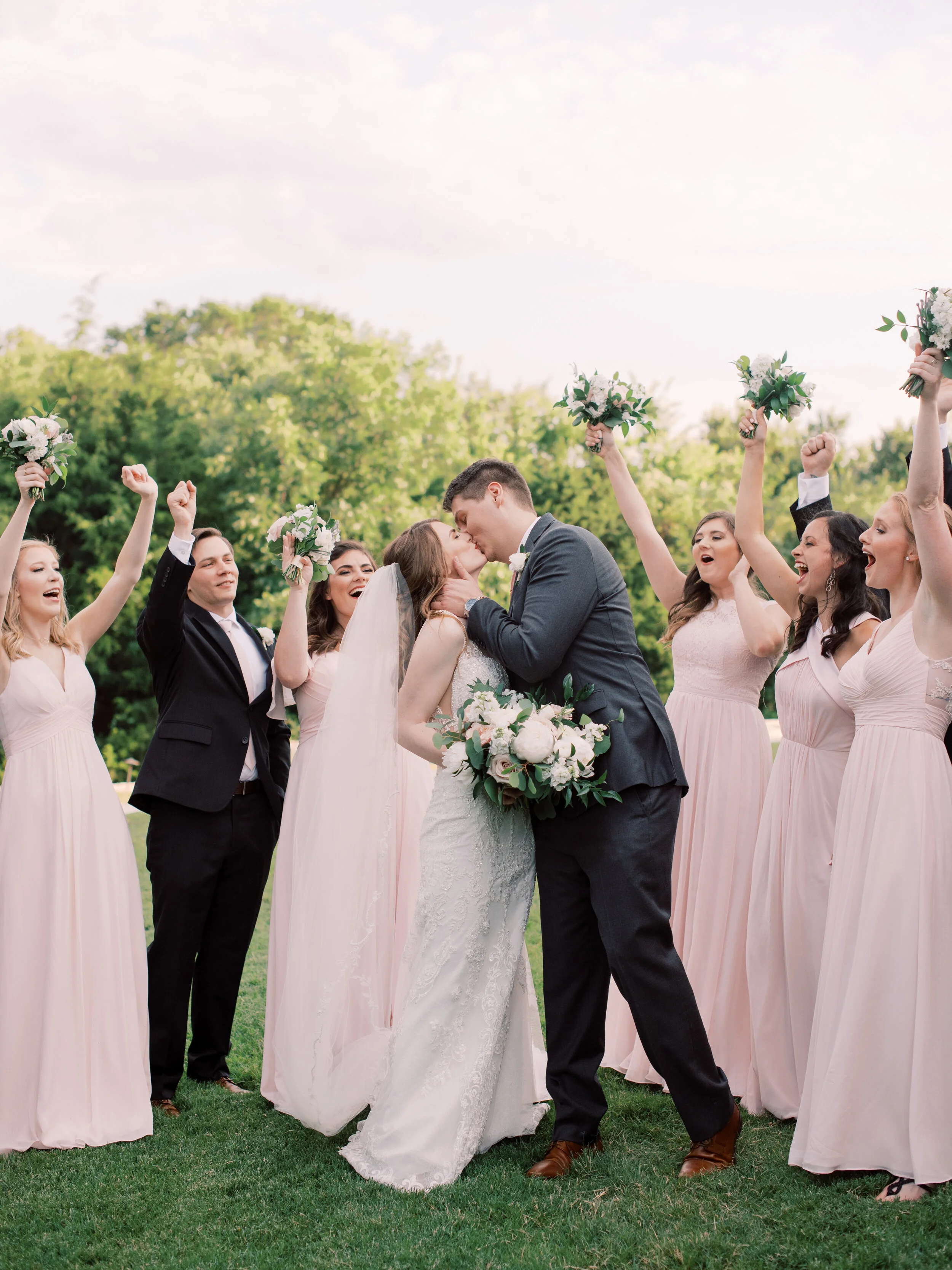
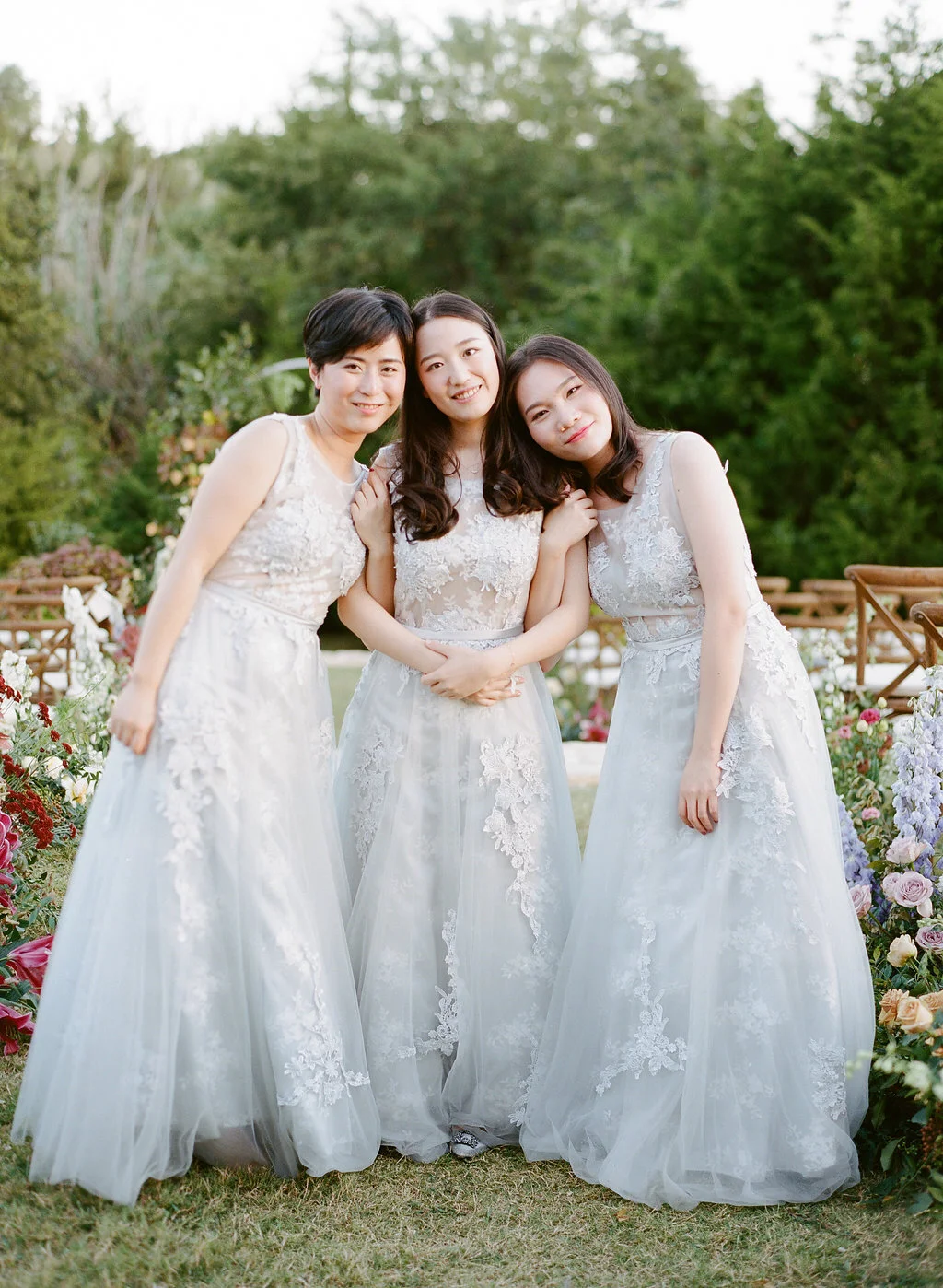
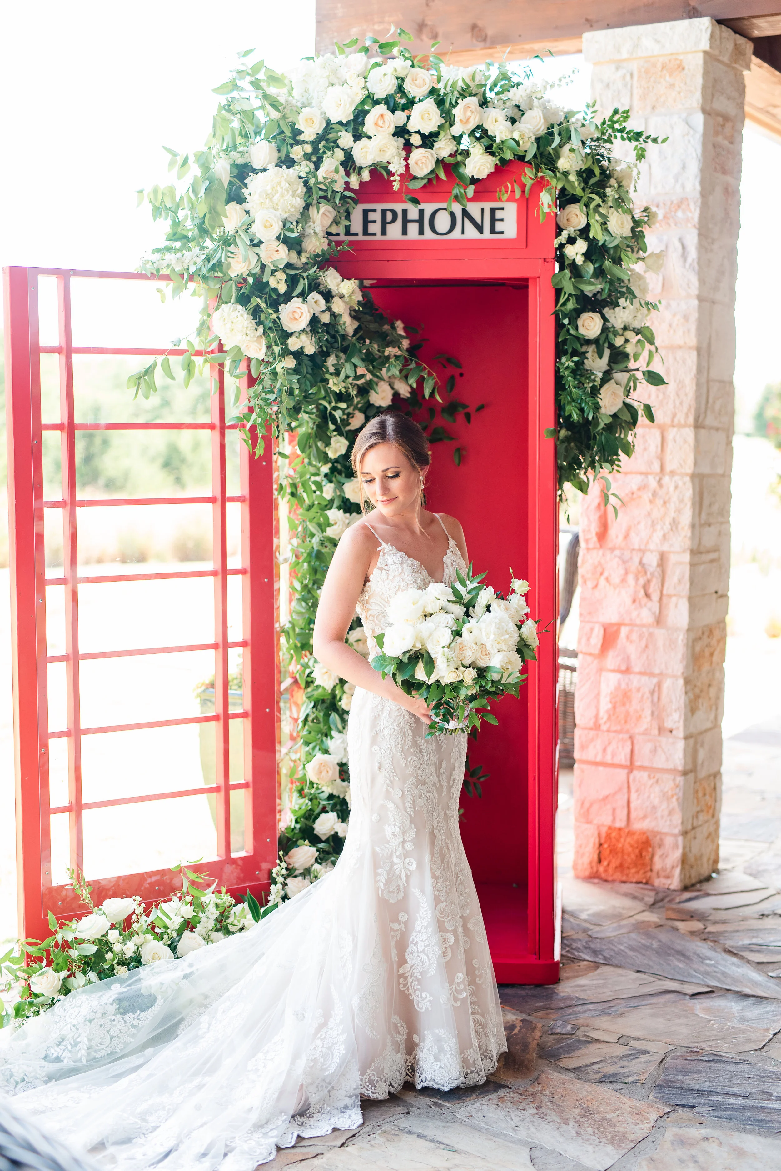
White & Neutrals
The classic look of white/neutral decor fits any theme or season. While white can reflect the crisp tones of winter, it can also provide a bright, fresh and cool perspective for Texas summers. Neutrals are also a timeless backdrop for greenery and any shade of blooms.


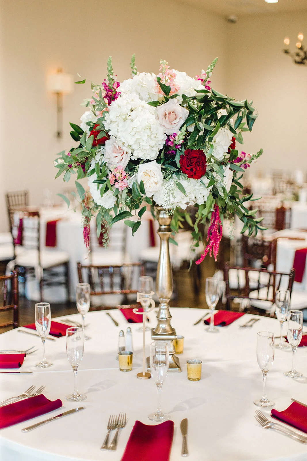
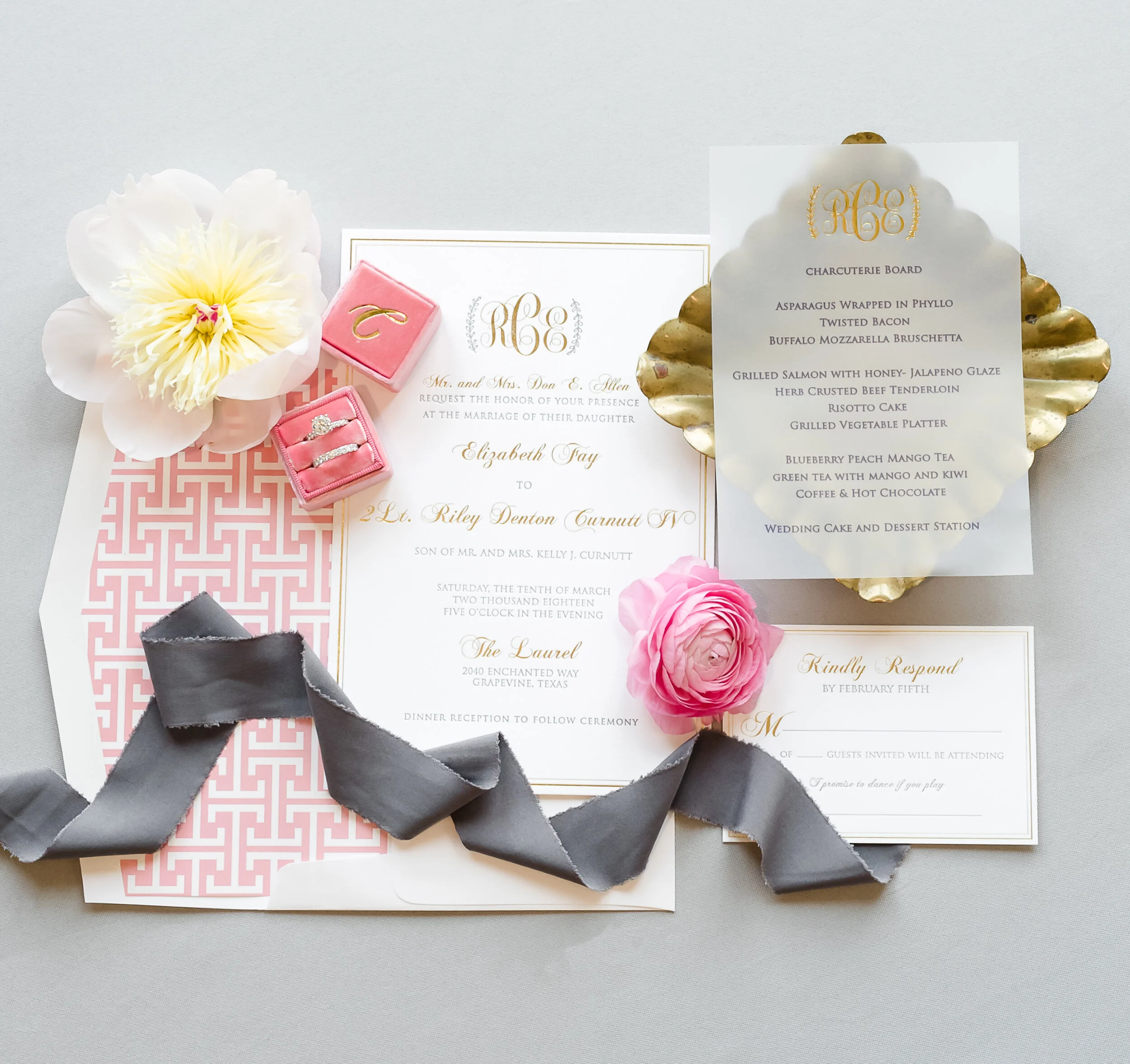
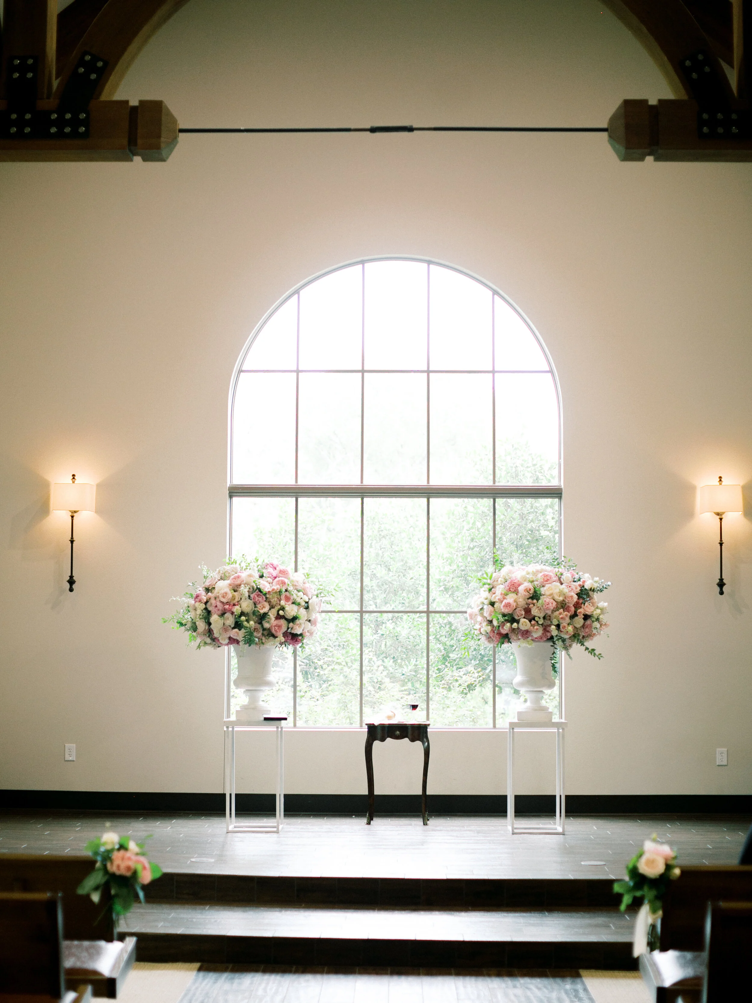
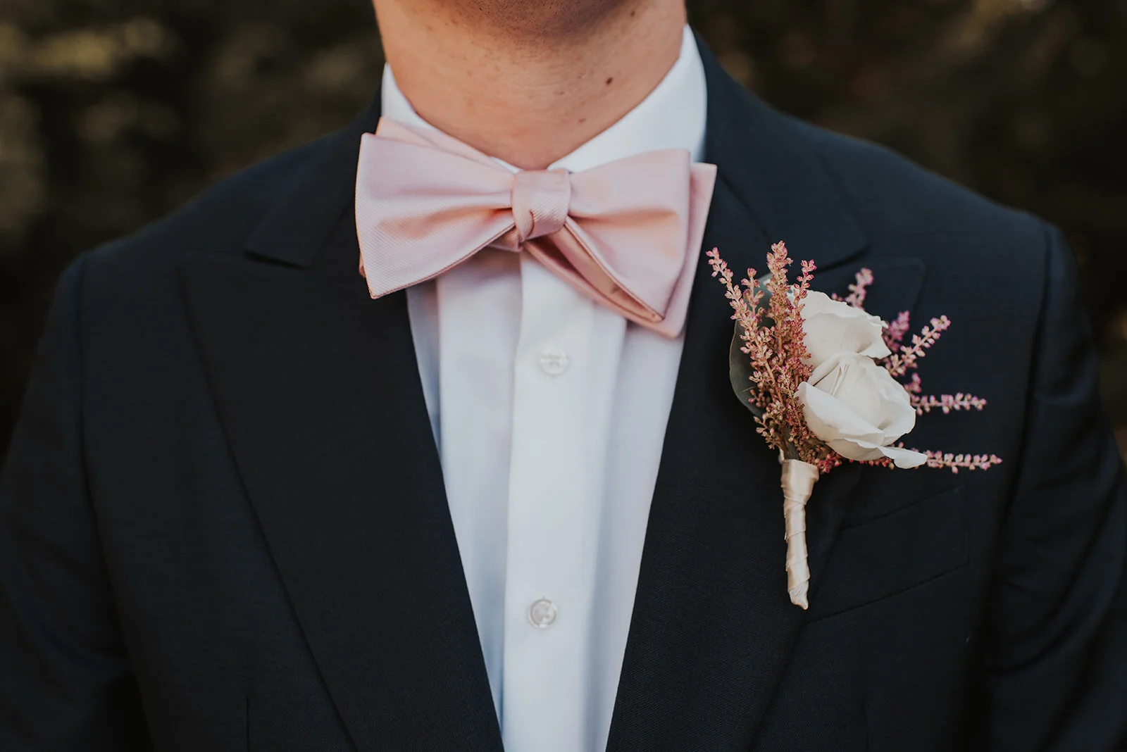
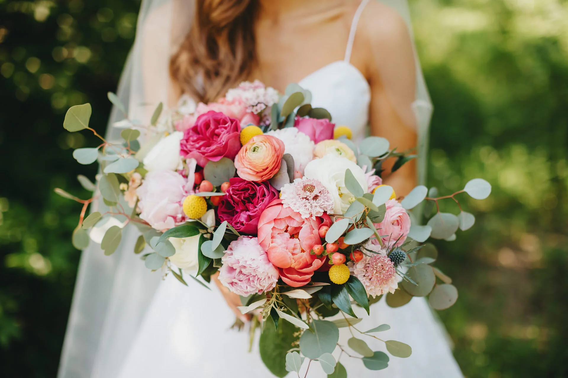
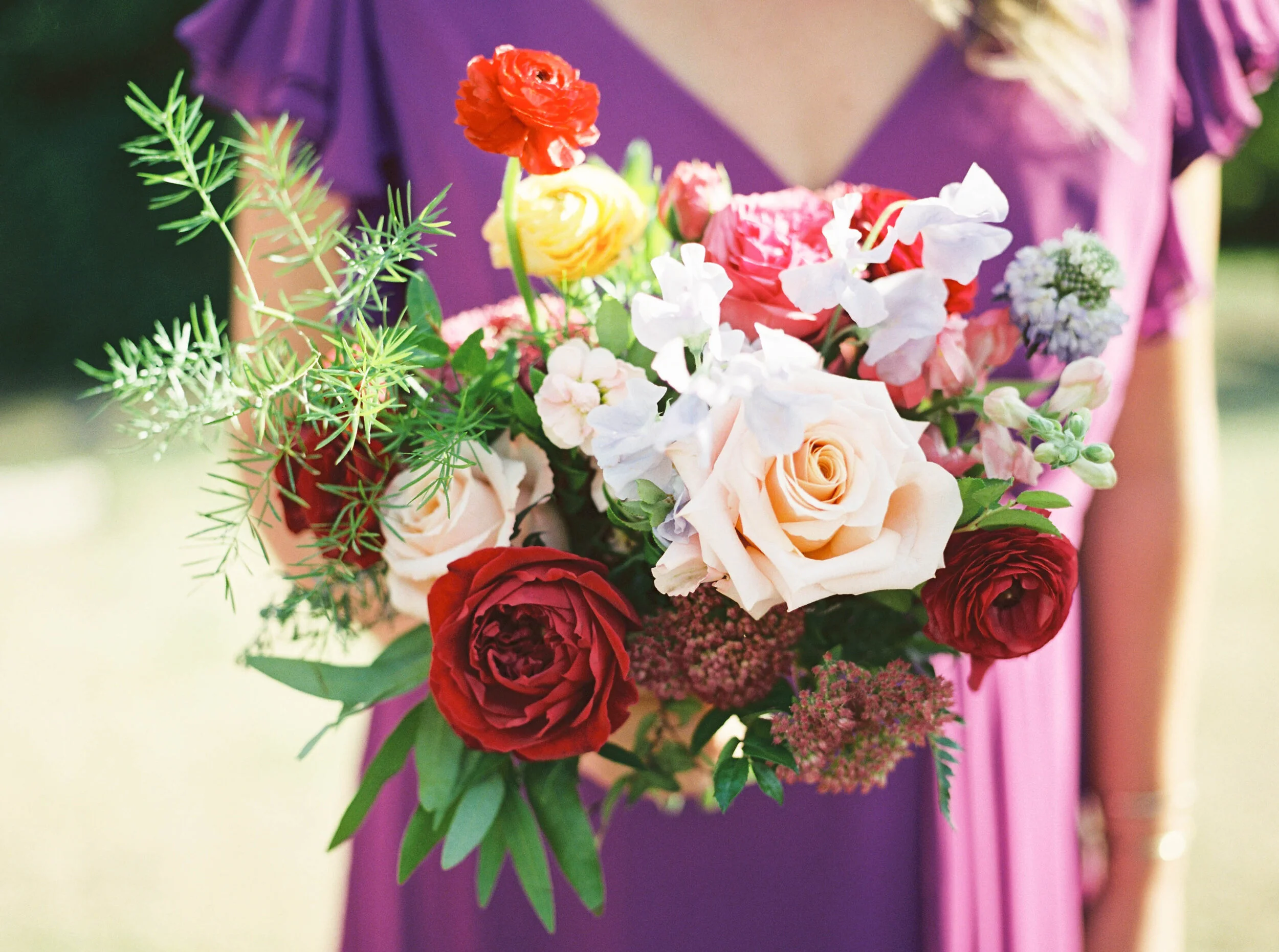
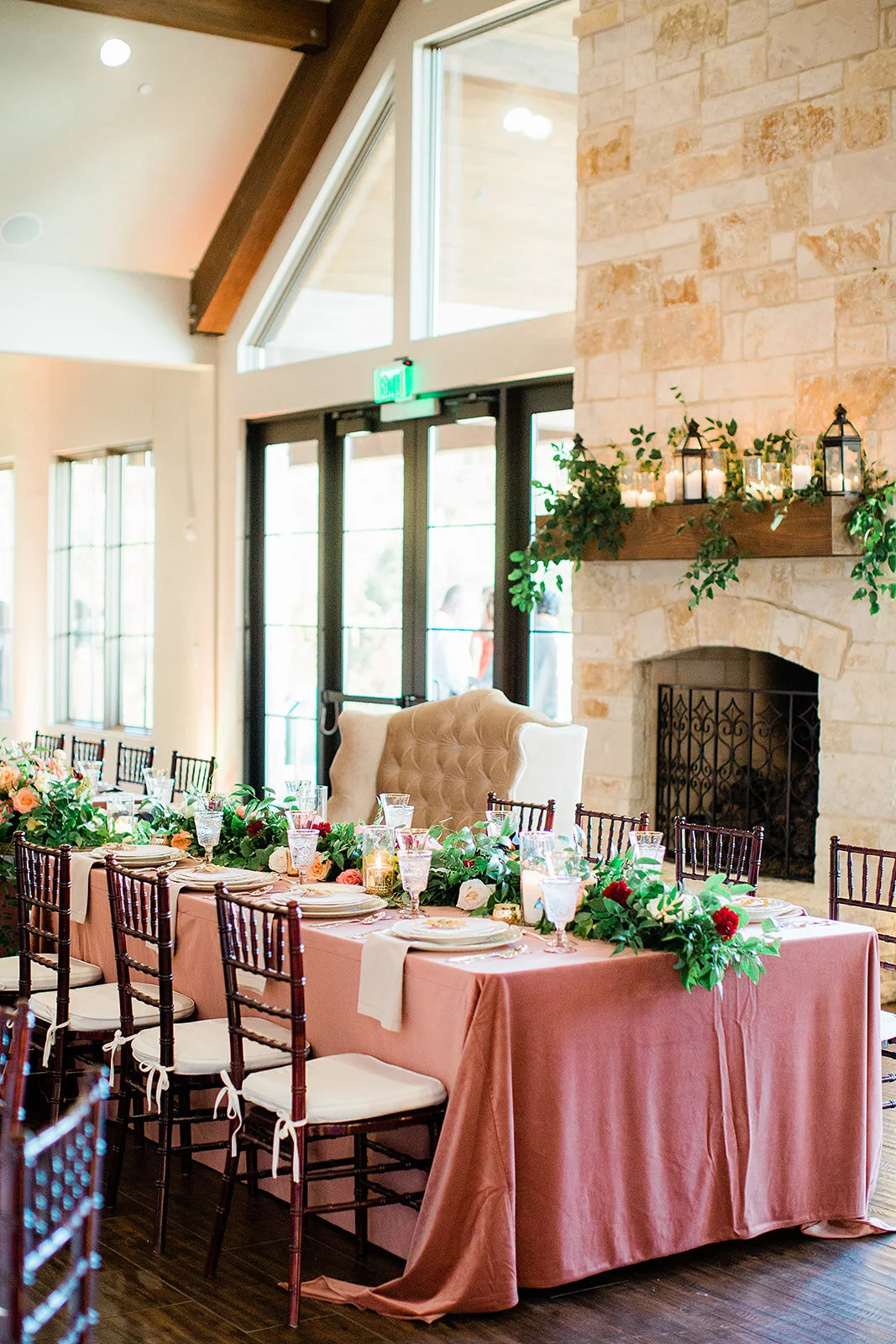
Pink & Blush
We always seem to notice that whenever there is any shade of pink involved in a wedding day, there’s a different sense of joy that fills the air. With options ranging from mauve to magenta, your day can have the crisp and clean feel of a classic blush wedding, or a boho flair with earthy details. Whatever shade you choose, the pink family is there to create a stunning accent for your day.


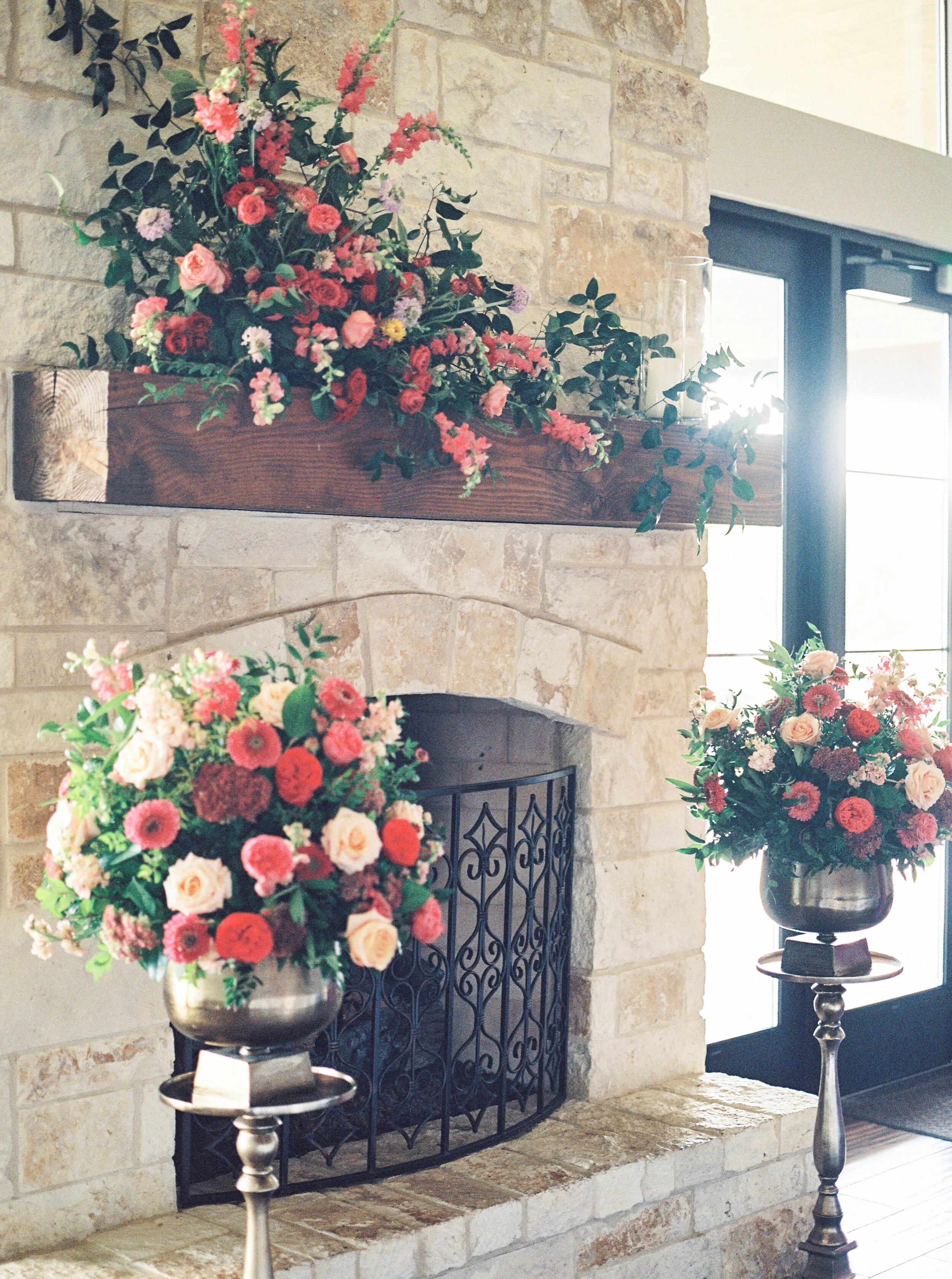


Grit and Gold Weddings, Avery Earl Photography, Something Pretty Floral
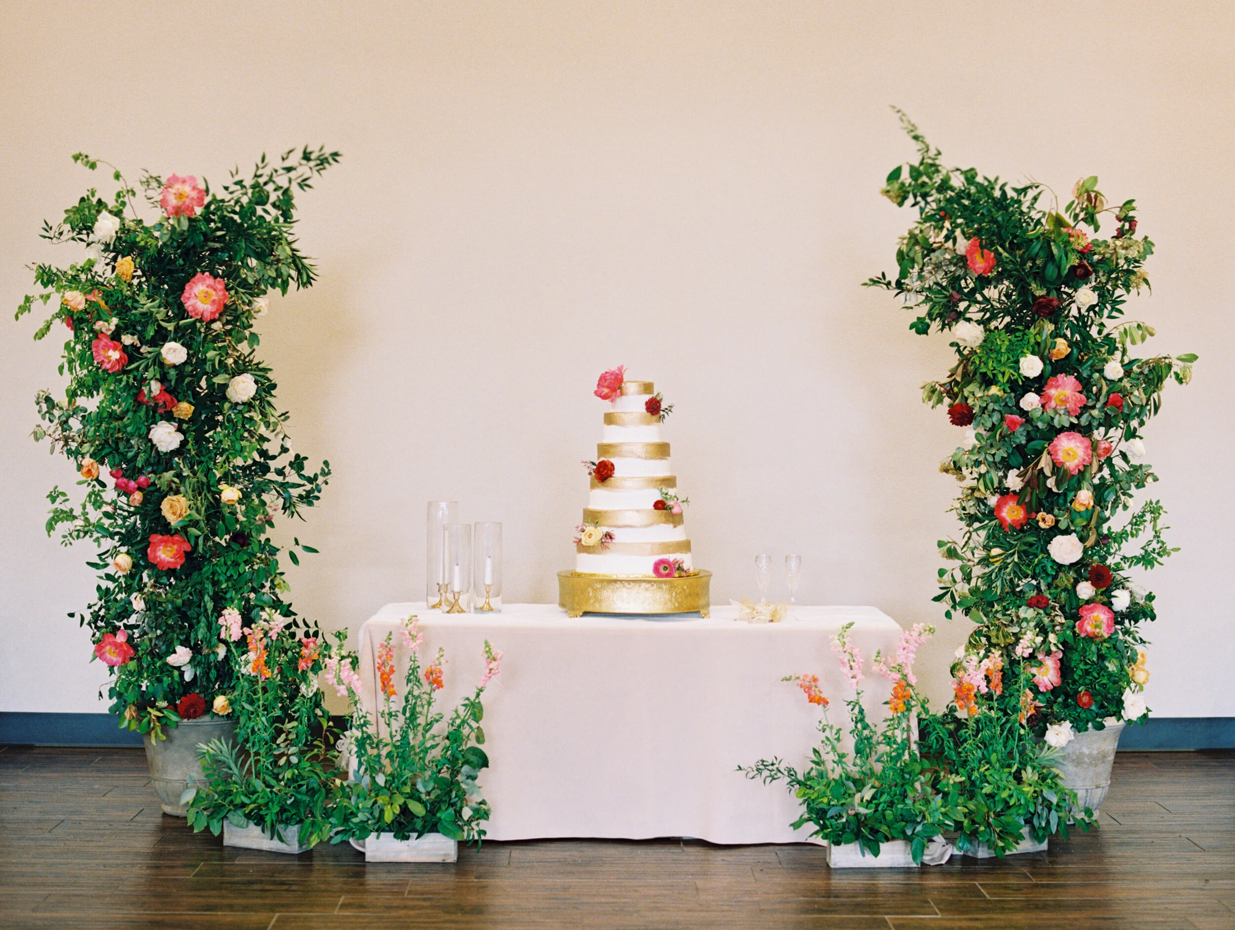
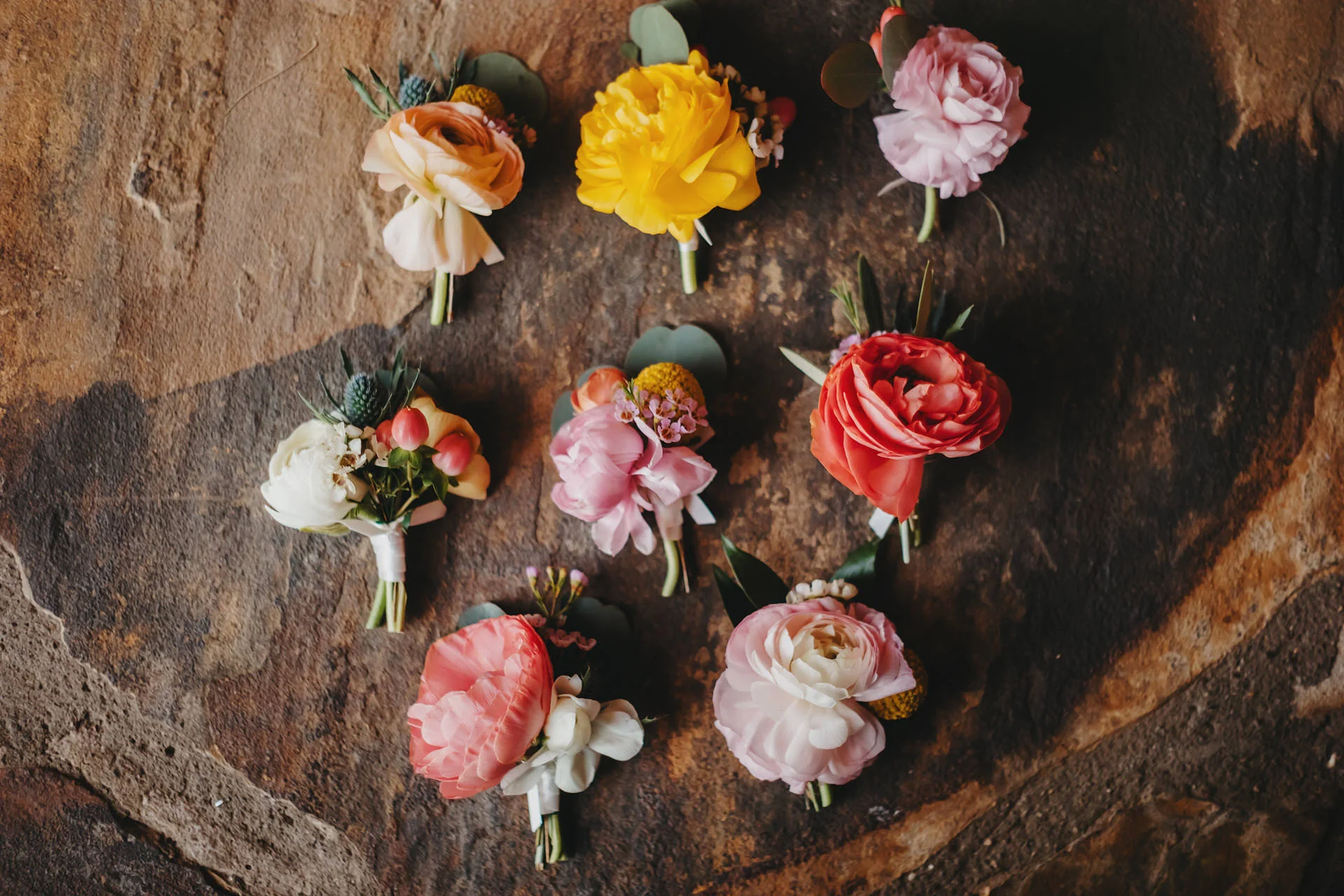
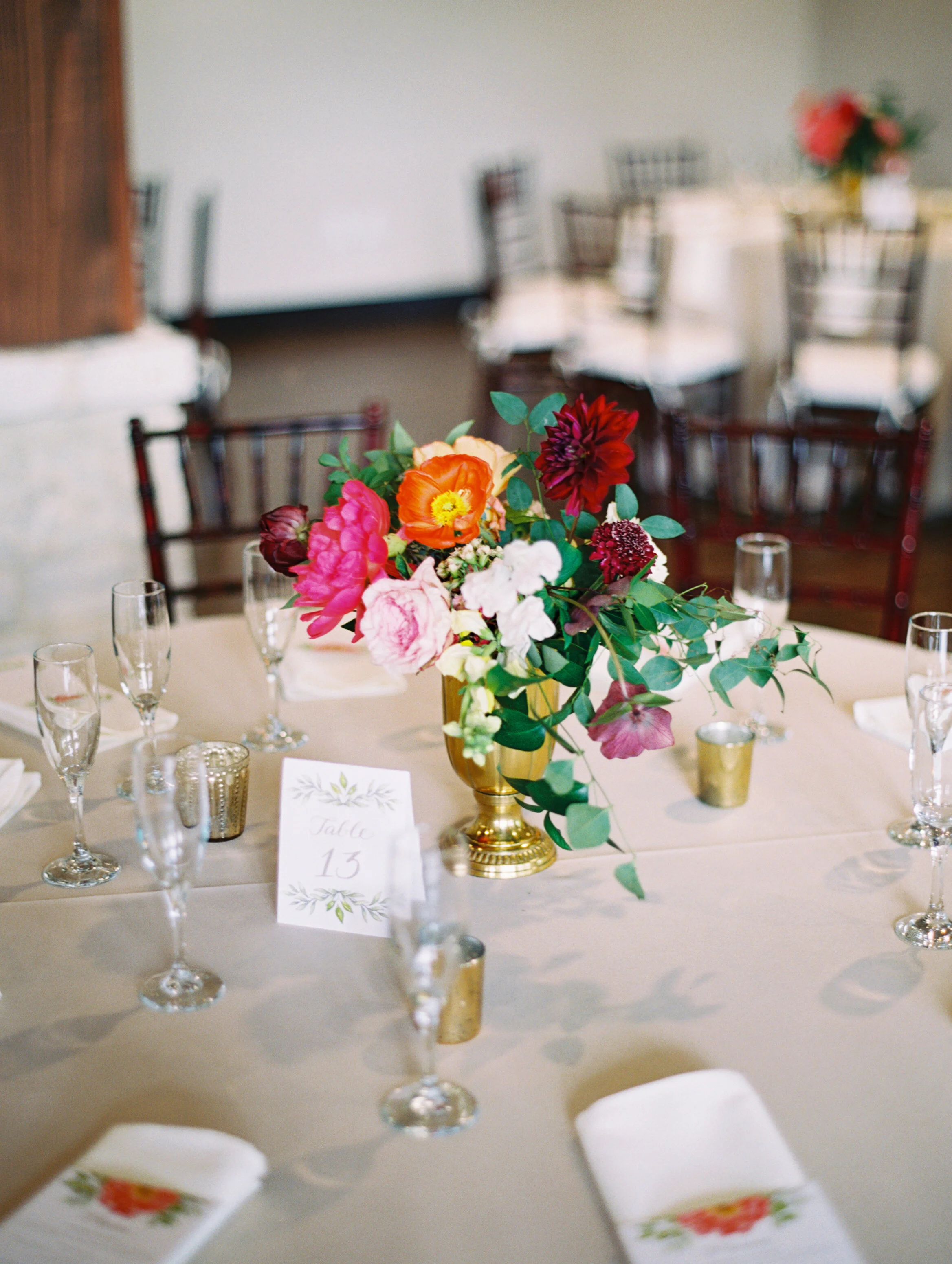
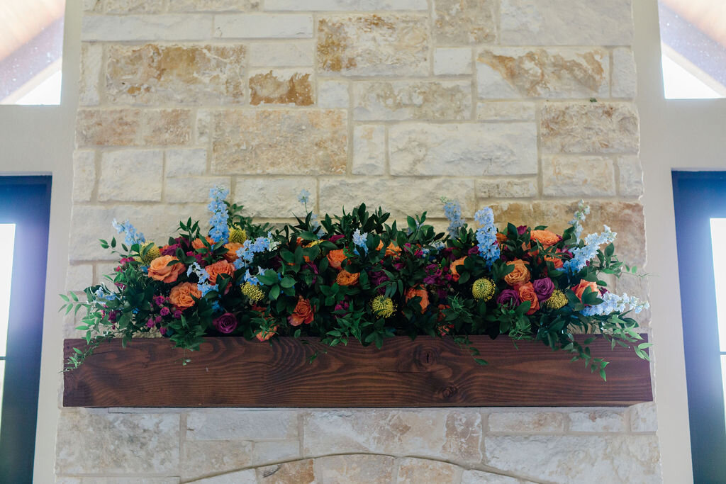
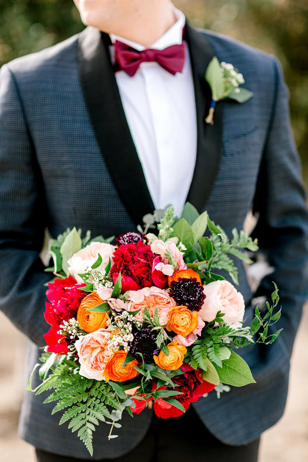
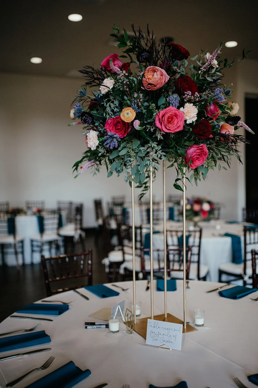
Bold & Bright
Just like seasonal transition pieces are essential to your wardrobe, we can’t help but love the color palettes that are displayed as summer transitions into fall. This period is filled with the mixture of bright summer shades and bold, moody tones. This contrast makes a statement- the best one, at that.

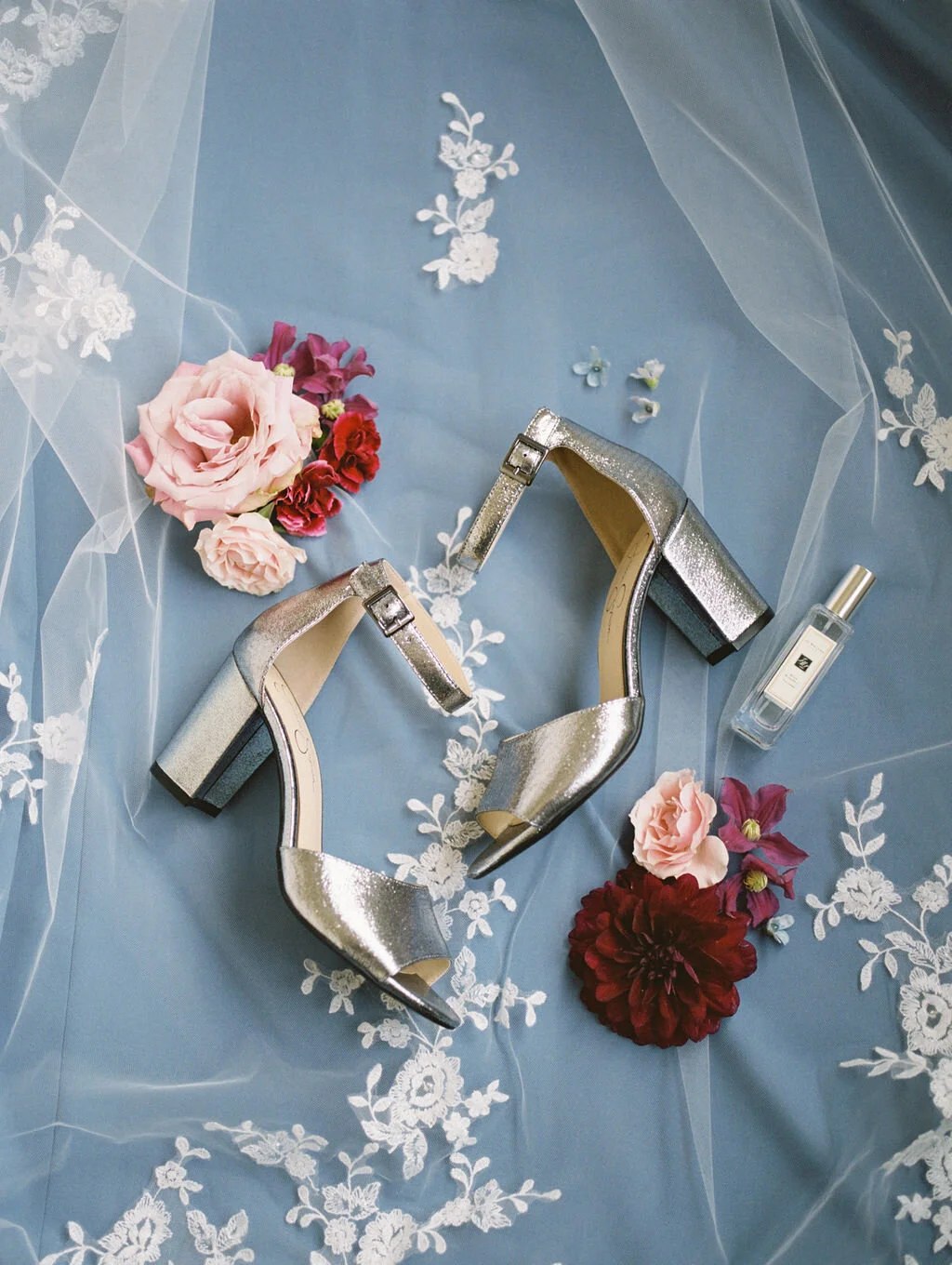

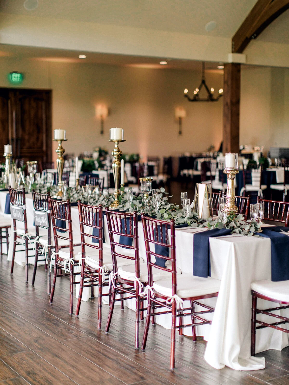
Blue Hues
We swoon over all the blue hues. From light blue, to dusty blue, to navy, blue is another shade that can be used in any season. At The Laurel, some of our favorite blue color palettes paired well with both classic white, and colorful florals. Blue allows the opportunity to create a moody fall wedding or a bright spring soiree, and everything in between.


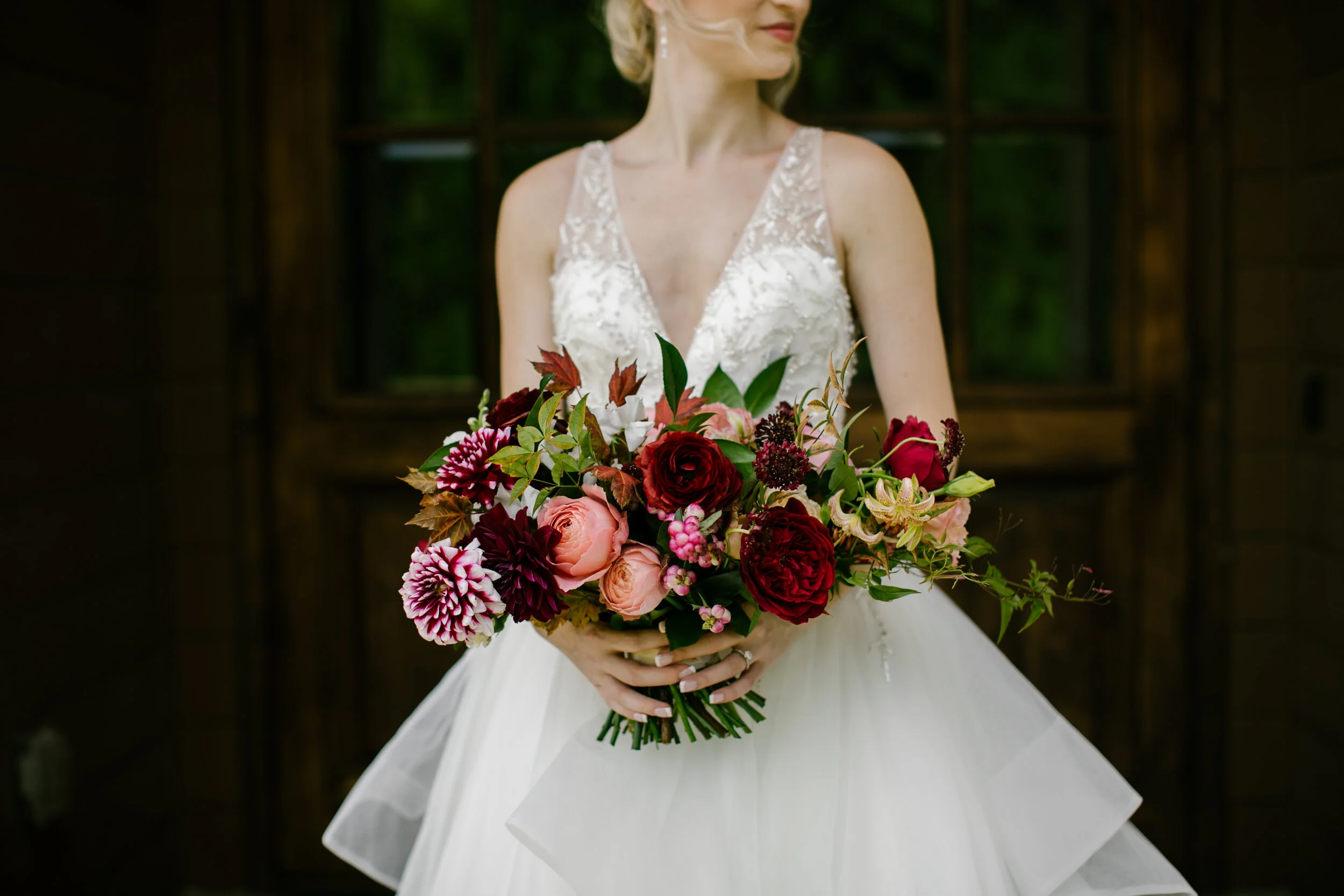
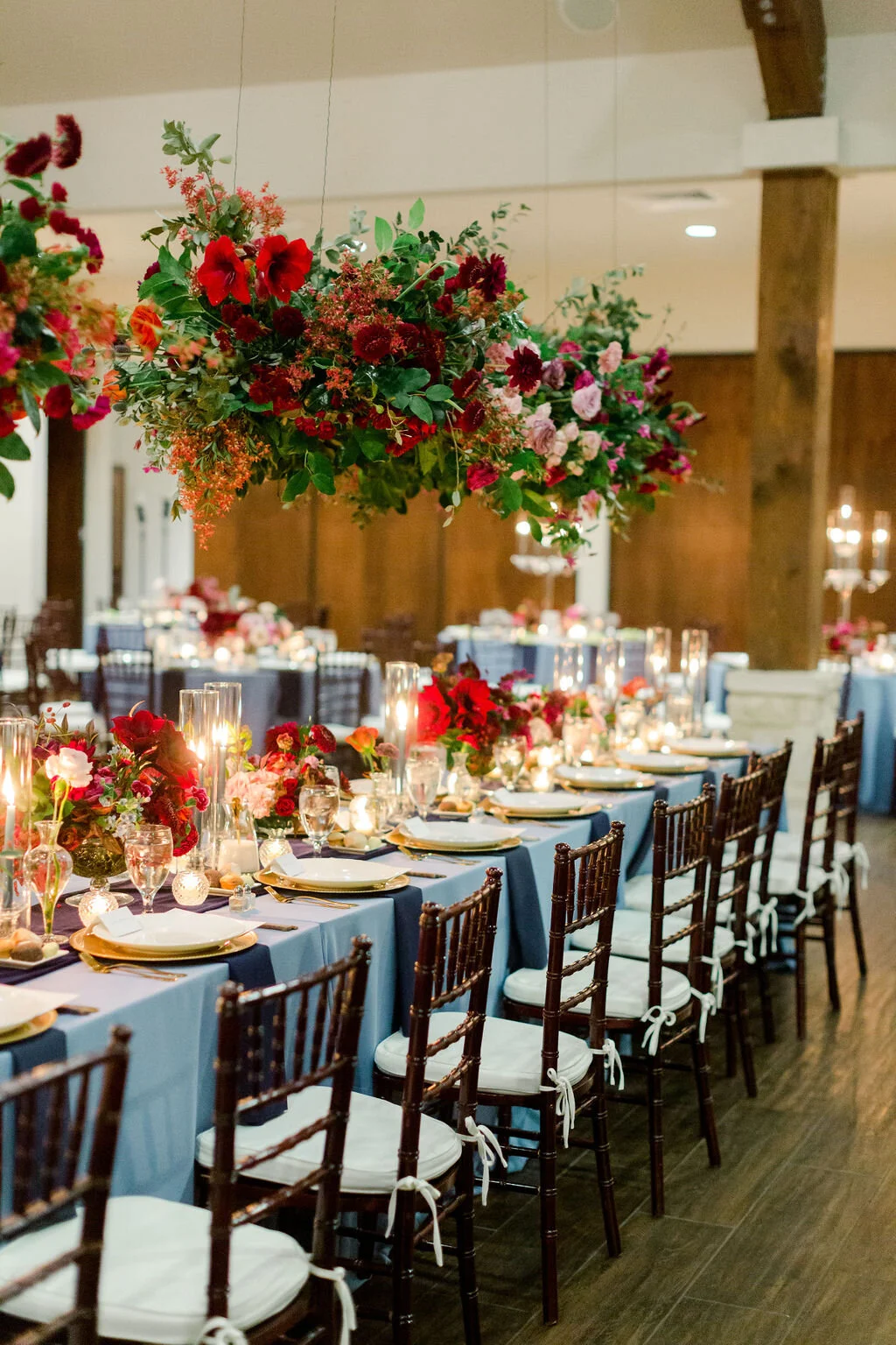
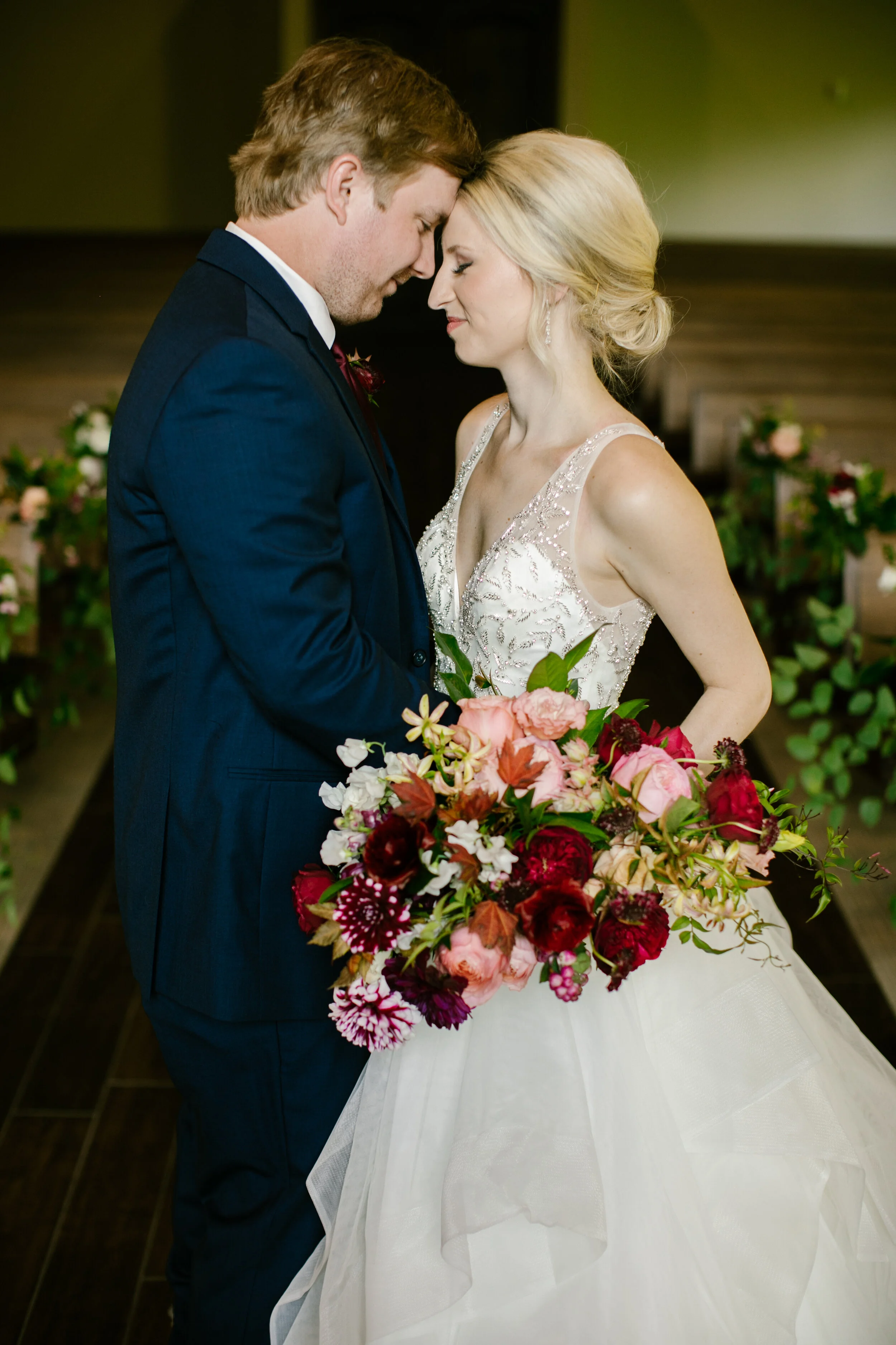
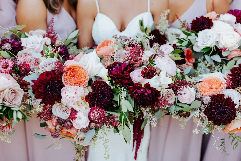
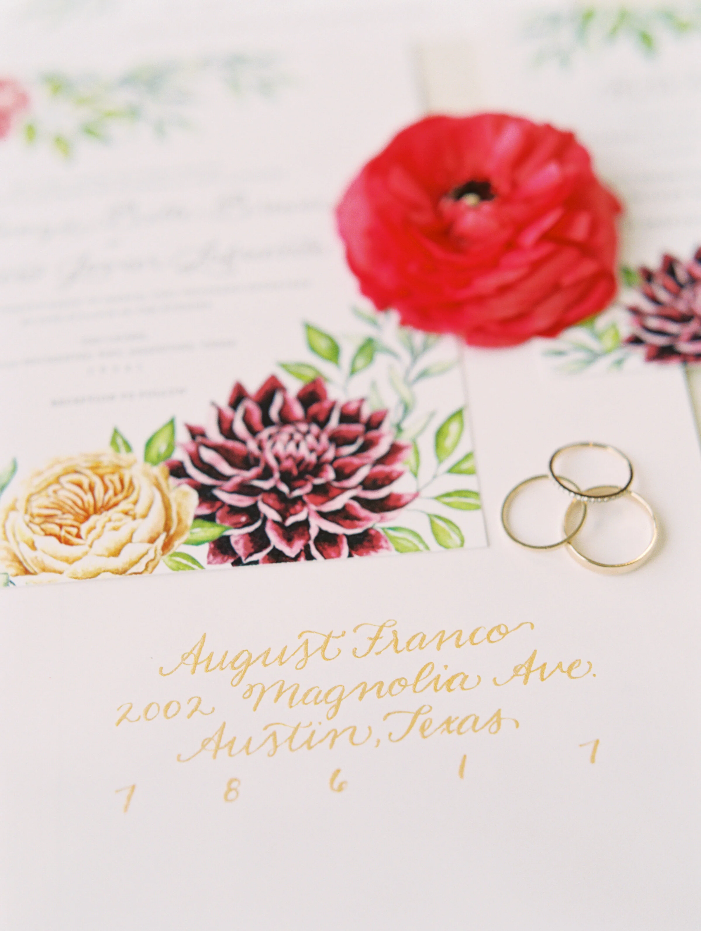
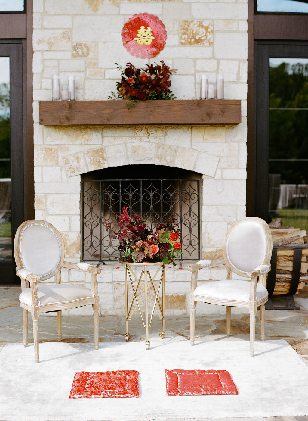
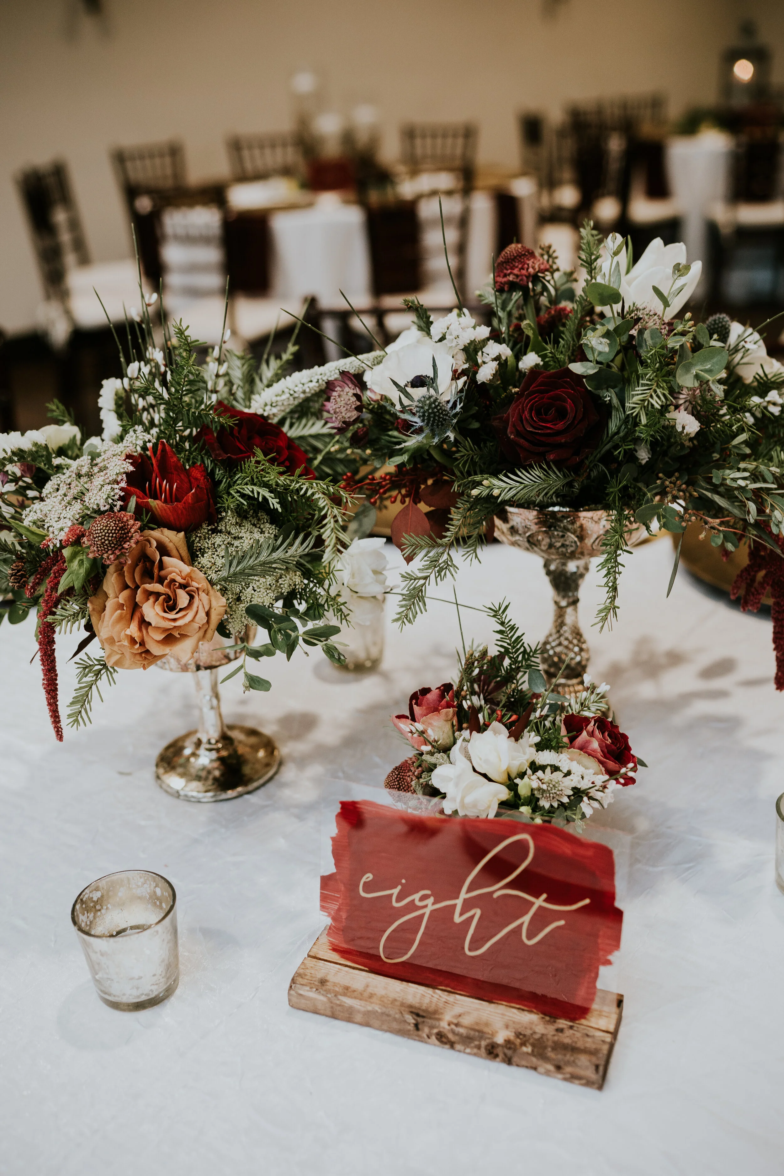
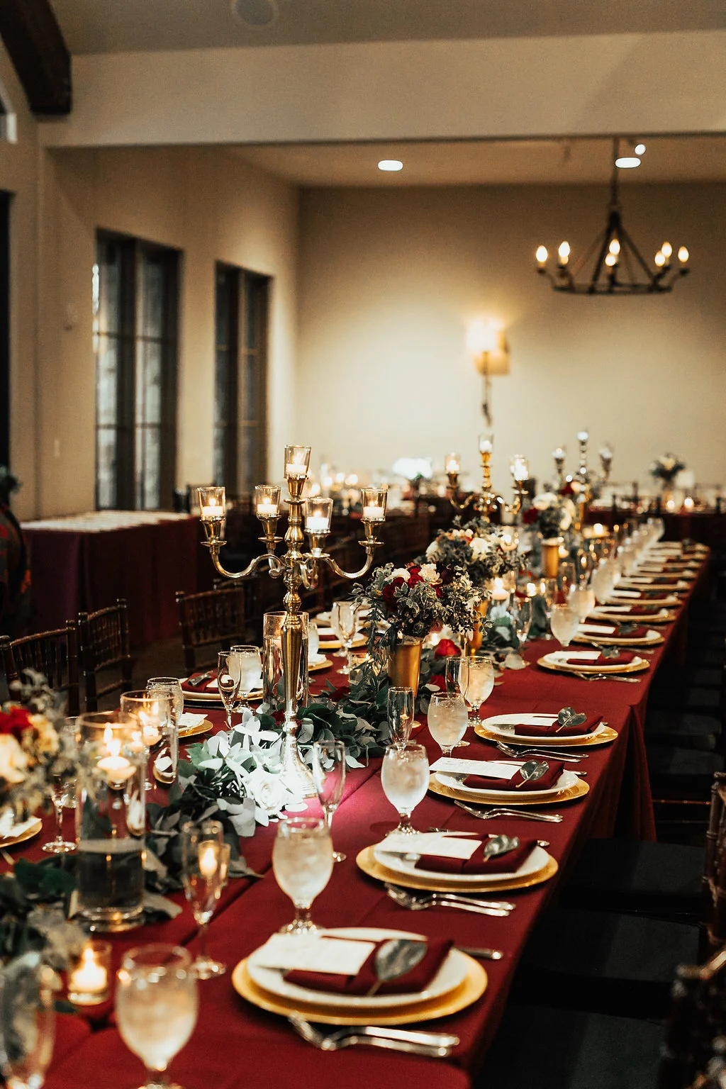
Moody, Burgundy, & Jewel tones
Deep and richly colored details always catch our eye. There’s something about them that complements the wooden tresses and serves as a show stopping contrast to the creamy stone elements of The Laurel. We see these color palettes mostly in the fall and winter, as they offer another dimension alongside the ever-changing landscape outside our doors.


All of these color palettes simply leave us in awe, and we can’t wait to see what creativity lies ahead. We hope these palettes leave you with new ideas and fresh inspiration as you plan your big day!